Design System
Internal use only - not indexed
Colors
Primary
primary
var(--color-primary)
#1a73e8
primary-light
var(--color-primary-light)
#4285f4
primary-dark
var(--color-primary-dark)
#1557b0
Typography
Heading 1 (text-4xl)
Font: System UI, font-weight: bold
Heading 2 (text-3xl)
Font: System UI, font-weight: bold
Heading 3 (text-2xl)
Font: System UI, font-weight: bold
Heading 4 (text-xl)
Font: System UI, font-weight: bold
Normal paragraph text (text-base)
Font: System UI, font-weight: normal
Small text (text-sm)
Font: System UI, font-weight: normal
Gradients
Primary gradient
bg-gradient-to-r from-primary to-primary-light
background: linear-gradient(to right, var(--color-primary), var(--color-primary-light));CSS Variables
CSS Variables from configuration
| Variable Name | Value | Preview |
|---|---|---|
| Primary Colors | ||
| --color-primary | #ff0000 | |
| --color-primary-light | #4285f4 | |
| --color-primary-dark | #1557b0 | |
| Secondary Colors | ||
| --color-secondary | #34a853 | |
| --color-secondary-light | #46c167 | |
| --color-secondary-dark | #2d8644 | |
| Accent Color | ||
| --color-accent | #fbbc05 | |
| Text Colors | ||
| --color-text | #202124 | |
| --color-text-light | #5f6368 | |
| --color-text-muted | #9aa0a6 | |
| Background Colors | ||
| --color-background | #ffffff | |
| --color-background-alt | #f8f9fa | |
| --color-background-dark | #f1f3f4 | |
Icons
Complete collection of icons available in the boilerplate theme. Icons can be used by including them as partials using this syntax:
{{ partial "icons/icon-name" . }}or with custom classes:
{{ partial "icons/icon-name" "w-8 h-8 text-blue-600" }}Icon name copied to clipboard!
Icons are based on Heroicons collection. Outline icons have no suffix (e.g. "check"), while solid icons have "-solid" suffix (e.g. "check-solid"). Click on an icon to copy its name.
Partials
📚 Complete Partials Reference
Comprehensive documentation for all FlowHunt Hugo boilerplate partials with live examples, realistic data, and implementation guides. Choose the right partial for your needs and copy the syntax directly.
💡 Navigation: Use the category sections below to explore different types of partials. Each category includes detailed documentation with live examples and best practices.
🗂️ Partial Categories
Select a category to view detailed documentation and examples for each type of partial:
Components
Buttons, cards, media, navigation, quotes, and other UI components
Sections
Hero, CTA, features, pricing, stats, and other page sections
Layout
Headers, footers, and structural layout components
Helpers
Language helpers, content utilities, and head management
Icons
Complete Heroicons library with outline and solid variants
Products
Product showcases, galleries, and detailed presentations
Utils
Analytics, link building, and utility functions
🧩 Components Documentation
UI components including buttons, cards, media elements, navigation, and interactive components.
View Complete Components Guide🧩 Components Reference
Reusable UI components that can be used throughout your site. These components are the building blocks for larger sections and layouts.
💡 Tip: Components are designed to be highly reusable and customizable. Most accept color, text, and styling parameters.
Buttons
Primary Button
Main action button with customizable colors and styling.
Usage:
{{ partial "components/buttons/primary.html" (dict
  "text" "Get Started"
  "url" "/signup"
  "textColor" "white"
  "bgColor" "blue-600"
  "hoverBgColor" "blue-500"
  "classes" "w-full sm:w-auto"
  "target" "_self"
  "ariaLabel" "Sign up for account"
) }}
Live Example:
Secondary Button
Secondary action button with outline styling.
Usage:
{{ partial "components/buttons/secondary.html" (dict
  "text" "Learn More"
  "url" "/features"
  "textColor" "blue-700"
  "borderColor" "blue-600"
  "hoverBgColor" "blue-50"
  "classes" "ml-4"
) }}
Live Example:
Text Button
Minimal text-only button for subtle actions.
Usage:
{{ partial "components/buttons/text.html" (dict
  "text" "Skip for now"
  "url" "/dashboard"
  "textColor" "gray-600"
  "hoverTextColor" "gray-900"
  "underline" true
) }}
Live Example:
Icon Button
Button with icon support for enhanced visual communication.
Usage:
{{ partial "components/buttons/icon.html" (dict
  "text" "Download PDF"
  "url" "/document.pdf"
  "icon" "download"
  "iconPosition" "left"
  "textColor" "white"
  "bgColor" "indigo-600"
  "hoverBgColor" "indigo-500"
) }}Media
Lazy Image
Optimized image component with lazy loading and responsive sizing.
Usage:
{{ partial "components/media/lazyimg.html" (dict
  "src" "/images/product-screenshot.jpg"
  "alt" "Product dashboard screenshot"
  "class" "rounded-lg shadow-xl"
  "width" "1200"
  "height" "800"
  "sizes" "(min-width: 1024px) 1024px, (min-width: 768px) 768px, 100vw"
  "loading" "lazy"
  "gallery" true
) }}
Live Example:


YouTube Video
Embedded YouTube video with lazy loading support.
Usage:
{{ partial "components/media/youtubevideo.html" (dict
  "videoID" "jNQXAC9IVRw"
  "title" "Product Demo Video"
  "class" "rounded-lg shadow-xl"
  "width" "800px"
  "height" "450px"
  "autoplay" false
  "mute" false
) }}
Live Example:

Cards
Feature Card
Card component for displaying features, services, or content blocks.
Usage:
{{ partial "components/cards/feature.html" (dict
  "title" "Advanced Analytics"
  "description" "Get deep insights into your data with our powerful analytics engine."
  "icon" "chart-bar"
  "iconColor" "blue-600"
  "link" (dict "text" "Learn more" "url" "/analytics")
  "image" (dict "src" "/images/analytics.jpg" "alt" "Analytics dashboard")
  "badge" (dict "text" "Popular" "color" "green")
) }}
Product Card
Card for displaying products, pricing plans, or offerings.
Usage:
{{ partial "components/cards/product.html" (dict
  "title" "Pro Plan"
  "price" "$29"
  "period" "per month"
  "description" "Perfect for growing teams"
  "features" (slice "10 team members" "100GB storage" "Priority support")
  "cta" (dict "text" "Choose Plan" "url" "/signup/pro")
  "featured" true
  "badge" "Most Popular"
) }}
Navigation
Breadcrumbs
Navigation breadcrumbs for showing page hierarchy.
Usage:
{{ partial "components/breadcrumbs/basic.html" (dict
  "items" (slice
    (dict "text" "Home" "url" "/")
    (dict "text" "Products" "url" "/products")
    (dict "text" "Analytics" "url" "/products/analytics")
    (dict "text" "Dashboard" "current" true)
  )
  "separator" "/"
  "classes" "text-sm"
) }}
Pagination
Pagination component for navigating through multiple pages.
Usage:
{{ partial "components/navigation/pagination.html" (dict
  "currentPage" 3
  "totalPages" 10
  "baseUrl" "/blog/page/"
  "showFirstLast" true
  "showPrevNext" true
  "maxVisible" 5
) }}
Quote & Testimonials
Blockquote
Quote component with author attribution and optional image.
Usage:
{{ partial "components/quote/blockquote.html" (dict
  "text" "This platform has completely transformed how we handle data analysis."
  "name" "Sarah Johnson"
  "title" "Data Science Director"
  "company" "TechCorp Inc."
  "imageUrl" "/images/testimonials/sarah.jpg"
  "size" "large"
  "alignment" "center"
) }}
Live Example:

"FlowHunt has revolutionized our workflow automation. What used to take hours now takes minutes, and the AI insights are incredibly accurate."Alex Chen
Review Card
Customer review card with rating stars and detailed feedback.
Usage:
{{ partial "components/reviews/card.html" (dict
  "rating" 5
  "title" "Excellent product!"
  "text" "This tool has saved us countless hours and improved our productivity."
  "name" "Michael Rodriguez"
  "title" "Project Manager"
  "date" "2024-01-15"
  "verified" true
) }}
📋 Component Guidelines
Usage Best Practices:
- • Always provide required parameters (marked as required)
- • Use semantic color names for consistency
- • Include alt text for all images for accessibility
- • Test components across different screen sizes
- • Combine components to build complex UI sections
Available Component Categories:
- • Buttons: primary, secondary, text, icon
- • Media: lazyimg, youtubevideo
- • Cards: feature, product, review
- • Navigation: breadcrumbs, pagination, menus
- • Content: blockquote, testimonials, tables
🔘 Buttons
Primary, secondary, text, and icon buttons with full customization
🖼️ Media
Lazy images, YouTube videos, and responsive media components
💬 Quotes
Testimonials and blockquotes with author attribution
"Great product experience"
📄 Sections Documentation
Page sections including hero areas, CTAs, features, pricing, stats, and team showcases.
View Complete Sections Guide🏗️ Sections Reference
Complete page sections that combine multiple components into cohesive layouts. These are the main building blocks for creating full pages.
💡 Tip: Sections are designed to work together and can be easily customized with different backgrounds, colors, and content structures.
Hero Sections
Simple Centered Hero
Centered hero section with optional announcement, heading, description, CTA buttons, and image.
Usage:
{{ partial "sections/hero/simple_centered.html" (dict
  "heading" "Transform Your Business with AI"
  "description" "Discover powerful automation tools that boost productivity by 10x."
  "cta" (dict
    "primary" (dict "text" "Start Free Trial" "url" "/signup")
    "secondary" (dict "text" "Watch Demo" "url" "/demo")
  )
  "announcement" (dict
    "enabled" true
    "text" "🎉 New AI features now available!"
    "linkText" "Learn more"
    "linkUrl" "/features"
  )
  "image" (dict
    "enabled" true
    "src" "/images/hero-dashboard.png"
    "alt" "Dashboard screenshot"
    "width" "1200"
    "height" "800"
  )
) }}
Live Example:
Revolutionize Your Workflow with AI
Discover powerful automation tools that transform how you work. Build custom AI workflows without coding and boost your productivity by 10x.

Split Hero with Image
Two-column hero layout with text content on one side and image on the other.
Usage:
{{ partial "sections/hero/split_with_image.html" (dict
  "logo" "/images/logo.svg"
  "heading" "Powerful analytics for your business"
  "description" "Get insights from your data with our analytics platform."
  "cta" (dict
    "primary" (dict "text" "Get Started" "url" "/signup")
    "secondary" (dict "text" "Learn More" "url" "/features")
  )
  "tags" (slice "analytics" "business-intelligence" "data-science")
  "image" "/images/analytics-dashboard.jpg"
  "announcement" (dict
    "enabled" true
    "text" "Just launched!"
    "linkText" "Read announcement"
    "linkUrl" "/blog/launch"
  )
) }}
Live Example:
Advanced Data Analytics Made Simple
Transform raw data into actionable insights with our intuitive analytics platform. No technical expertise required - start making data-driven decisions today.

Split Hero with Screenshot
Hero section optimized for showcasing product screenshots with perspective transform.
Usage:
{{ partial "sections/hero/split_with_screenshot.html" (dict
  "heading" "See your data come to life"
  "description" "Beautiful visualizations and real-time insights at your fingertips."
  "cta" (dict
    "primary" (dict "text" "Try Dashboard" "url" "/dashboard")
    "secondary" (dict "text" "Watch Video" "url" "/video")
  )
  "screenshot" (dict
    "src" "/images/product-screenshot.png"
    "alt" "Product dashboard screenshot"
    "width" "1200"
    "height" "800"
  )
  "features" (slice "Real-time updates" "Custom dashboards" "Export reports")
) }}
Live Example:
Experience the Power of Visual Analytics
Transform complex data into beautiful, interactive visualizations. Our intuitive dashboard makes it easy to spot trends, track KPIs, and share insights with your team.
Split Hero with YouTube Video
Hero section featuring an embedded YouTube video for product demos or explainer content.
Usage:
{{ partial "sections/hero/split_with_youtube_video.html" (dict
  "heading" "Watch how it works"
  "description" "See our platform in action and learn how to get started in minutes."
  "video" (dict
    "videoID" "jNQXAC9IVRw"
    "title" "Product Demo Video"
    "thumbnail" "/images/video-thumbnail.jpg"
  )
  "cta" (dict
    "primary" (dict "text" "Start Trial" "url" "/signup")
    "secondary" (dict "text" "Schedule Demo" "url" "/demo")
  )
  "stats" (slice
    (dict "value" "10M+" "label" "Data points processed")
    (dict "value" "99.9%" "label" "Uptime guarantee")
  )
) }}
Live Example:
See FlowHunt in Action

Call to Action Sections
Simple Centered CTA
Centered call-to-action section with primary and secondary buttons.
Usage:
{{ partial "sections/cta/simple_centered.html" (dict
  "heading" "Ready to transform your business?"
  "description" "Join thousands of companies already using AI to boost productivity."
  "primaryCta" (dict "text" "Start Free Trial" "url" "/signup")
  "secondaryCta" (dict "text" "Book Demo" "url" "/demo")
  "primaryCtaColor" "indigo-600"
  "primaryCtaHoverColor" "indigo-500"
  "backgroundColor" "bg-gray-50"
) }}
Live Example:
Ready to Transform Your Business?
Join thousands of companies already using AI to automate workflows and boost productivity. Start your free trial today.
Dark Panel CTA
Dark-themed CTA section for high-contrast call-to-action moments.
Usage:
{{ partial "sections/cta/dark_panel.html" (dict
  "heading" "Supercharge your workflow today"
  "description" "Get started with our powerful automation platform in minutes."
  "cta" (dict "text" "Get Started Now" "url" "/signup")
  "features" (slice "No credit card required" "14-day free trial" "Cancel anytime")
  "pattern" "dots"
  "ctaColor" "white"
) }}
Feature Sections
Features with Fading Image
Feature showcase with alternating content and fading background images.
Usage:
{{ partial "sections/features/with_fading_image.html" (dict
  "heading" "Everything you need to succeed"
  "description" "Comprehensive tools for modern businesses"
  "features" (slice
    (dict
      "title" "Advanced Analytics"
      "description" "Get deep insights into your data with powerful visualization tools."
      "icon" "chart-bar"
      "image" "/images/features/analytics.jpg"
    )
    (dict
      "title" "Real-time Collaboration"
      "description" "Work together seamlessly with your team, anywhere in the world."
      "icon" "users"
      "image" "/images/features/collaboration.jpg"
    )
  )
) }}
Live Example:

Everything You Need to Succeed
Comprehensive AI tools designed for modern businesses that want to stay ahead of the competition.
- Origin
- Designed by Good Goods, Inc.
- Material
- Solid walnut base with rare earth magnets and polycarbonate add-ons.
- Dimensions
- 15" x 3.75" x .75"
- Finish
- Hand sanded and finished with natural oil
- Includes
- Pen Tray, Phone Tray, Small Tray, Large Tray, Sticky Note Holder
- Considerations
- Made from natural materials. Grain and color vary with each item.
Features with Wide Images
Feature section with large, prominent images alongside feature descriptions.
Usage:
{{ partial "sections/features/with_wide_images.html" (dict
  "heading" "Powerful features for every team"
  "description" "Built for scale, designed for simplicity"
  "features" (slice
    (dict
      "title" "Intuitive Dashboard"
      "description" "Monitor all your workflows from a single, beautiful dashboard."
      "image" "/images/dashboard-wide.jpg"
      "imageAlt" "Dashboard screenshot"
      "reverse" false
    )
    (dict
      "title" "Automated Workflows"
      "description" "Set up complex automation that runs 24/7 without intervention."
      "image" "/images/workflows-wide.jpg"
      "imageAlt" "Workflow builder interface"
      "reverse" true
    )
  )
) }}
Live Example:
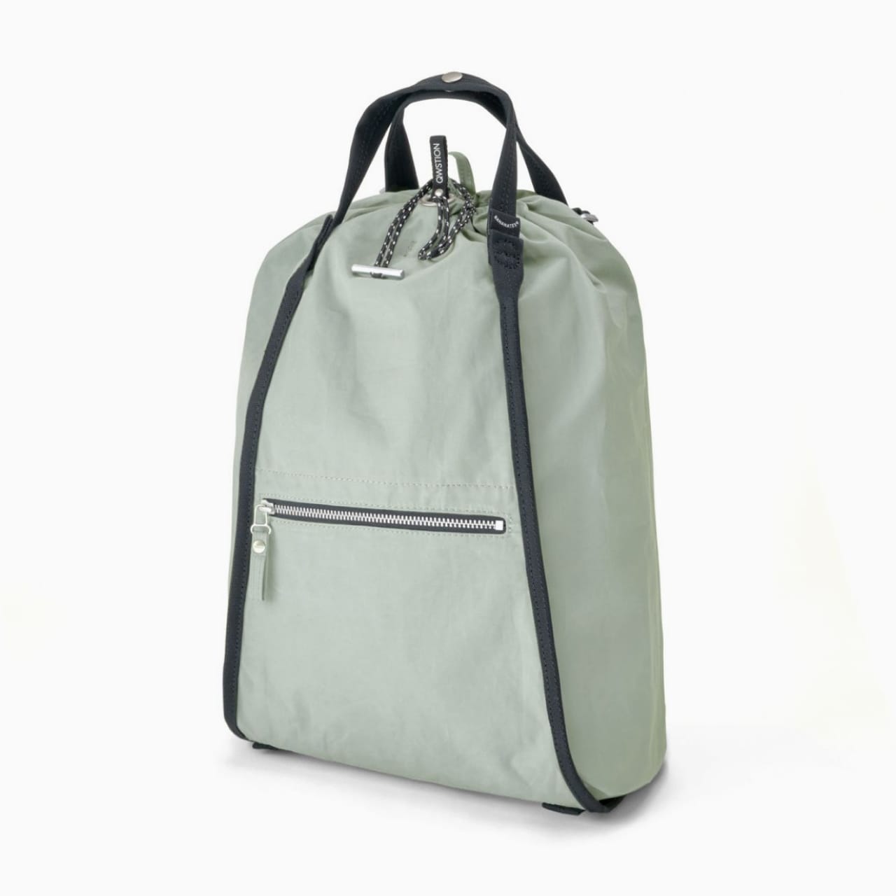
Drawstring Canister
Powerful Features for Every Team
Built for scale, designed for simplicity. Our platform grows with your business needs.
Intuitive Visual Builder
Create complex AI workflows with our intuitive drag-and-drop interface. No programming knowledge required - just connect the dots and watch your automation come to life.
Smart Data Processing
Process and analyze data from multiple sources automatically. Our AI engine learns patterns and optimizes workflows for maximum efficiency and accuracy.
Pricing Sections
Simple Pricing Table
Clean pricing table with feature comparison and call-to-action buttons.
Usage:
{{ partial "sections/pricing/simple.html" (dict
  "heading" "Choose your plan"
  "description" "Start free, scale as you grow"
  "plans" (slice
    (dict
      "name" "Starter"
      "price" "$9"
      "period" "per month"
      "description" "Perfect for individuals"
      "features" (slice "1 user" "10GB storage" "Basic support")
      "cta" (dict "text" "Get Started" "url" "/signup/starter")
      "popular" false
    )
    (dict
      "name" "Professional"
      "price" "$29"
      "period" "per month"
      "description" "Ideal for growing teams"
      "features" (slice "10 users" "100GB storage" "Priority support" "Advanced features")
      "cta" (dict "text" "Choose Pro" "url" "/signup/pro")
      "popular" true
    )
  )
) }}
Statistics Sections
Simple Statistics
Display key metrics and achievements in an engaging grid layout.
Usage:
{{ partial "sections/stats/simple.html" (dict
  "heading" "Trusted by teams worldwide"
  "description" "Companies of all sizes rely on our platform"
  "stats" (slice
    (dict "value" "10M+" "label" "Workflows executed")
    (dict "value" "50K+" "label" "Active users")
    (dict "value" "99.9%" "label" "Uptime")
    (dict "value" "24/7" "label" "Support")
  )
  "backgroundColor" "bg-gray-50"
) }}
Live Example:
- Workflows executed
- 50M+
- Active users
- 100K+
- Uptime guarantee
- 99.9%
- Expert support
- 24/7
Team Sections
Team Grid
Showcase your team members with photos, roles, and social links.
Usage:
{{ partial "sections/team/grid.html" (dict
  "heading" "Meet our team"
  "description" "The people behind the product"
  "members" (slice
    (dict
      "name" "Jane Smith"
      "role" "CEO & Founder"
      "image" "/images/team/jane.jpg"
      "bio" "10+ years in AI and automation"
      "social" (dict
        "twitter" "https://twitter.com/janesmith"
        "linkedin" "https://linkedin.com/in/janesmith"
      )
    )
    (dict
      "name" "John Doe"
      "role" "CTO"
      "image" "/images/team/john.jpg"
      "bio" "Former Google engineer, ML expert"
      "social" (dict
        "twitter" "https://twitter.com/johndoe"
        "github" "https://github.com/johndoe"
      )
    )
  )
) }}
📋 Section Usage Guidelines
Section Categories:
- • Hero: simple_centered, split_with_image, split_with_screenshot
- • CTA: simple_centered, dark_panel
- • Features: with_fading_image, with_wide_images
- • Pricing: simple, with_comparison, enterprise
- • Stats: simple, with_background, counter_animation
- • Team: grid, carousel, detailed_bios
Design Tips:
- • Combine sections to create complete page layouts
- • Use consistent color schemes across sections
- • Alternate background colors for visual separation
- • Include clear calls-to-action in key sections
- • Optimize images for fast loading times
🎯 Hero Sections
Centered, split layouts with images, videos, and call-to-actions
⚡ CTA Sections
Call-to-action sections with customizable styles and layouts
✨ Feature Sections
Product features with images, grids, and interactive elements
🏗️ Layout Documentation
Structural components including headers, footers, and page layout elements.
View Complete Layout Guide🏗️ Layout Reference
Complete page layout components including headers and footers. These components provide the structural foundation for your pages.
💡 Tip: Layout components are designed to work together and can be mixed and matched to create unique page structures.
Header Layouts
Simple Header
Clean, minimal header layout with heading and description.
Usage:
{{ partial "layout/headers/simple.html" (dict
  "heading" "Welcome to FlowHunt"
  "description" "Build powerful AI workflows without writing code."
  "bgColor" "bg-white"
  "headingColor" "text-gray-900"
  "descriptionColor" "text-gray-600"
  "textAlign" "left"
) }}
Live Example:
AI Automation Made Simple
Transform your business processes with intelligent automation. No coding required - just connect, configure, and deploy.
Centered Header
Centered header layout perfect for landing pages and content sections.
Usage:
{{ partial "layout/headers/centered.html" (dict
  "heading" "Support Center"
  "description" "Find answers to your questions and get help from our team."
  "bgColor" "bg-gray-50"
  "headingColor" "text-gray-900"
  "descriptionColor" "text-gray-500"
  "maxWidth" "max-w-3xl"
) }}
Live Example:
Documentation Center
Everything you need to know about building AI workflows, from beginner tutorials to advanced integration guides.
Header with Eyebrow
Header with an eyebrow text above the main heading for additional context.
Usage:
{{ partial "layout/headers/simple_with_eyebrow.html" (dict
  "eyebrow" "New Feature"
  "heading" "Introducing Smart Workflows"
  "description" "AI-powered automation that learns and adapts to your business needs."
  "eyebrowColor" "text-indigo-600"
  "bgColor" "bg-white"
) }}
Live Example:
Product Update
Introducing Advanced Analytics
Get deeper insights into your workflows with our new analytics dashboard. Track performance, identify bottlenecks, and optimize your automation for maximum efficiency.
Header with Stats
Header that includes key statistics or metrics alongside the main content.
Usage:
{{ partial "layout/headers/with_stats.html" (dict
  "heading" "Trusted by thousands of businesses"
  "description" "Companies worldwide rely on our platform to automate their workflows."
  "stats" (slice
    (dict "value" "50K+" "label" "Active users")
    (dict "value" "1M+" "label" "Workflows created")
    (dict "value" "99.9%" "label" "Uptime")
  )
  "bgColor" "bg-gray-50"
) }}
Live Example:

Trusted by Industry Leaders
Companies of all sizes use FlowHunt to automate their most critical business processes and scale their operations efficiently.
- Active users
- 100K+
- Workflows executed
- 5M+
- Uptime guarantee
- 99.9%
- Expert support
- 24/7
Dark Header
Dark-themed header for high-contrast sections or premium feel.
Usage:
{{ partial "layout/headers/simple_on_dark.html" (dict
  "heading" "Enterprise Solutions"
  "description" "Advanced features and dedicated support for large organizations."
  "bgColor" "bg-gray-900"
  "headingColor" "text-white"
  "descriptionColor" "text-gray-300"
  "pattern" "dots"
) }}
Live Example:
Enterprise-Grade AI Automation
Scale your business with enterprise-level security, compliance, and dedicated support. Built for organizations that demand the highest standards.
Footer Layouts
Simple Centered Footer
Minimal footer with centered content, perfect for simple pages.
Usage:
{{ partial "layout/footers/simple_centered.html" (dict
  "companyName" "FlowHunt"
  "description" "AI automation made simple"
  "links" (slice
    (dict "text" "Privacy" "url" "/privacy")
    (dict "text" "Terms" "url" "/terms")
    (dict "text" "Support" "url" "/support")
  )
  "social" (dict
    "twitter" "https://twitter.com/flowhunt"
    "linkedin" "https://linkedin.com/company/flowhunt"
    "github" "https://github.com/flowhunt"
  )
  "bgColor" "bg-gray-50"
) }}
Live Example:
4-Column Footer
Comprehensive footer with multiple sections for navigation and information.
Usage:
{{ partial "layout/footers/4-column_simple.html" (dict
  "companyName" "FlowHunt"
  "description" "The future of business automation"
  "columns" (slice
    (dict
      "title" "Product"
      "links" (slice
        (dict "text" "Features" "url" "/features")
        (dict "text" "Pricing" "url" "/pricing")
        (dict "text" "Integrations" "url" "/integrations")
      )
    )
    (dict
      "title" "Company"
      "links" (slice
        (dict "text" "About" "url" "/about")
        (dict "text" "Careers" "url" "/careers")
        (dict "text" "Blog" "url" "/blog")
      )
    )
    (dict
      "title" "Support"
      "links" (slice
        (dict "text" "Help Center" "url" "/help")
        (dict "text" "Documentation" "url" "/docs")
        (dict "text" "API" "url" "/api")
      )
    )
  )
  "social" (dict
    "twitter" "https://twitter.com/flowhunt"
    "linkedin" "https://linkedin.com/company/flowhunt"
  )
) }}
Live Example:
Footer with Call-to-Action
Footer that includes a prominent call-to-action section above the main footer content.
Usage:
{{ partial "layout/footers/4-column_with_call-to-action.html" (dict
  "cta" (dict
    "heading" "Ready to get started?"
    "description" "Join thousands of businesses automating with AI"
    "button" (dict "text" "Start Free Trial" "url" "/signup")
  )
  "companyName" "FlowHunt"
  "columns" (slice
    (dict
      "title" "Product"
      "links" (slice
        (dict "text" "Features" "url" "/features")
        (dict "text" "Pricing" "url" "/pricing")
      )
    )
  )
) }}
Live Example:
Dark Footer
Dark-themed footer for consistent branding with dark headers or premium styling.
Usage:
{{ partial "layout/footers/4-column_simple_on_dark.html" (dict
  "companyName" "FlowHunt"
  "description" "Enterprise AI automation platform"
  "columns" (slice
    (dict
      "title" "Product"
      "links" (slice
        (dict "text" "Enterprise" "url" "/enterprise")
        (dict "text" "Security" "url" "/security")
        (dict "text" "Compliance" "url" "/compliance")
      )
    )
  )
  "bgColor" "bg-gray-900"
  "textColor" "text-gray-300"
) }}
Live Example:
📋 Layout Best Practices
Header Guidelines:
- • Use simple headers for basic pages and content
- • Centered headers work well for landing pages
- • Add eyebrows for product announcements or context
- • Include stats in headers to build credibility
- • Dark headers create premium, professional feel
Footer Guidelines:
- • Simple footers for minimal pages and blogs
- • 4-column footers for comprehensive site navigation
- • Include CTAs in footers to capture bottom-of-page visitors
- • Dark footers pair well with dark headers
- • Always include essential legal and contact links
⚠️ Design Note: Headers and footers should complement your page content and maintain consistent branding. Consider your page hierarchy and user journey when choosing layouts.
📋 Header Layouts
Simple, centered, with eyebrow, with stats, and dark variants
🦶 Footer Layouts
Centered, 4-column, with CTA, and dark themed footers
🔧 Helpers Documentation
Utility functions for language handling, content management, and head elements.
View Complete Helpers Guide🔧 Helpers & Utilities Reference
Helper functions and utility partials that provide common functionality across your site. These are typically used internally by other partials or for specific technical requirements.
💡 Tip: Helpers are usually called by other partials but can be used directly when you need specific functionality like language handling or content relationships.
Helper Functions
Get Language URL
Generates correct URLs for specific languages, handling translation URLs and fallbacks.
Usage:
{{ $url := partial "helpers/get-language-url.html" (dict
  "code" "en"
  "langData" $langData
  "currentPage" $currentPage
  "filePath" $filePath
) }}

<!-- Use in templates -->
<a href="{{ $url }}">{{ $langData.name }}</a>
Example Output:
Returns: URL string for the specified language
Get Country Code
Converts language codes to country codes for flag displays and regional settings.
Usage:
{{ $countryCode := partial "helpers/get-country-code.html" (dict
  "langCode" "en"
) }}

<!-- Use for flag images -->
<img src="/images/flags/{{ $countryCode | lower }}.svg"
     alt="{{ $countryCode }} flag"
     class="w-5 h-5">
Example Conversions:
Returns: Two-letter country code string
Generate Hreflang Links
Generates hreflang link tags for SEO and international site versions.
Usage:
<!-- In head section -->
{{ partial "helpers/generate-hreflang-links.html" (dict
  "currentPage" $currentPage
  "languages" site.Languages
  "alternateURLs" $alternateURLs
) }}

<!-- Generates multiple link rel="alternate" tags -->
Generated Output:
<link rel="alternate" hreflang="en" href="https://example.com/en/page/" />
<link rel="alternate" hreflang="es" href="https://example.com/es/page/" />
<link rel="alternate" hreflang="fr" href="https://example.com/fr/page/" />
<link rel="alternate" hreflang="x-default" href="https://example.com/en/page/" />Output: HTML link tags with hreflang attributes
Utility Partials
Related Content
Generates related content suggestions based on tags, categories, or custom relationships.
Usage:
{{ partial "utils/related_content.html" (dict
  "currentPage" $currentPage
  "maxItems" 3
  "source" "tags"
  "layout" "cards"
  "heading" "Related Articles"
  "showExcerpt" true
  "showDate" true
  "showAuthor" false
) }}
Live Example:
Related Articles
Getting Started with AI Workflows
Learn the basics of building your first automation workflow...
Mar 15, 2024Advanced Integration Patterns
Discover powerful integration techniques for complex workflows...
Mar 12, 2024Optimizing Performance
Tips and tricks for making your workflows run faster...
Mar 10, 2024Link Building
Intelligent link generation for internal linking and SEO optimization.
Usage:
{{ partial "utils/linkbuilding.html" (dict
  "content" $content
  "keywords" (slice "AI automation" "workflow" "integration")
  "targetPages" $targetPages
  "maxLinks" 5
  "openInNewTab" false
  "addNofollow" false
  "trackClicks" true
) }}
Example Output:
This is content about AI automation and how to build effective workflow systems. Our platform makes integration simple and powerful.
Output: Content with automatically generated internal links
Head Utilities
CSS Management
Manages CSS includes, minification, and optimization for performance.
Usage:
<!-- In head.html -->
{{ partial "head/css.html" (dict
  "page" $page
  "site" $site
  "environment" hugo.Environment
  "customCSS" (slice "/css/custom.css" "/css/theme.css")
  "inlineCSS" $inlineStyles
  "preload" true
) }}
Features:
- • Automatic CSS minification in production
- • Critical CSS inlining for performance
- • Preloading of important stylesheets
- • Environment-specific CSS loading
- • Custom CSS injection capability
JavaScript Management
Handles JavaScript loading, bundling, and optimization strategies.
Usage:
<!-- Before closing body tag -->
{{ partial "head/js.html" (dict
  "page" $page
  "site" $site
  "scripts" (slice "/js/app.js" "/js/analytics.js")
  "inlineJS" $inlineScripts
  "defer" true
  "async" false
) }}
Features:
- • Automatic script bundling and minification
- • Defer and async loading strategies
- • Inline script injection for critical code
- • Environment-specific script loading
- • Performance optimization for Core Web Vitals
CSS Variables
Generates CSS custom properties for theme customization and design tokens.
Usage:
{{ partial "head/variables.html" (dict
  "theme" $theme
  "colors" $colorPalette
  "typography" $typographyScale
  "spacing" $spacingScale
  "breakpoints" $breakpoints
  "darkMode" true
) }}
Generated Variables:
:root {
  --color-primary: #3b82f6;
  --color-secondary: #6b7280;
  --font-size-base: 1rem;
  --spacing-base: 1rem;
  --breakpoint-md: 768px;
}Output: CSS custom properties for consistent theming
Social Meta Tags
Social Meta Tags
Generates Open Graph, Twitter Card, and other social media meta tags for better sharing.
Usage:
<!-- In head.html -->
{{ partial "social-meta.html" (dict
  "page" $page
  "site" $site
  "title" $customTitle
  "description" $customDescription
  "image" $socialImage
  "type" "article"
  "twitter" true
  "facebook" true
  "linkedin" true
) }}
Generated Meta Tags:
<meta property="og:title" content="Page Title" />
<meta property="og:description" content="Page description..." />
<meta property="og:image" content="https://example.com/image.jpg" />
<meta property="og:type" content="article" />
<meta name="twitter:card" content="summary_large_image" />
<meta name="twitter:title" content="Page Title" />Output: Complete social media meta tags for optimal sharing
📋 Helper & Utility Guidelines
When to Use Helpers:
- • Building multilingual websites with language switching
- • Need automatic internal linking for SEO
- • Generating related content sections
- • Managing CSS/JS optimization automatically
- • Creating consistent social media meta tags
Performance Benefits:
- • Automatic CSS/JS minification in production
- • Critical resource preloading
- • Optimized social media sharing
- • SEO-friendly hreflang generation
- • Efficient related content algorithms
⚠️ Technical Note: Most helpers are called automatically by the theme, but you can use them directly for custom functionality. Always test helpers in your development environment before deploying.
🌐 Language Helpers
Multi-language support, hreflang, and localization utilities
📝 Content Utilities
Related content, link building, and content management
🧠 Head Utilities
CSS/JS management, variables, and social meta tags
🎨 Icons Documentation
Complete Heroicons library with outline and solid variants for every icon.
View Complete Icons Guide🎨 Icons Reference
Comprehensive icon library based on Heroicons with both outline and solid variants. All icons are optimized SVGs that scale perfectly and maintain crisp appearance at any size.
💡 Tip: Icons come in two variants: outline (default) and solid (-solid suffix). All icons are customizable with Tailwind CSS classes for size, color, and styling.
🧭 Navigation & UI
Essential icons for navigation, menus, and user interface elements.
Menu & Navigation
{{ partial "icons/bars-3.html" (dict "class" "w-6 h-6 text-gray-600") }}Arrows & Directions
⚡ Actions & Interactions
Icons for buttons, forms, and user interactions.
Common Actions
Communication
🏢 Business & Commerce
Icons for business applications, e-commerce, and professional features.
Finance & Commerce
Office & Productivity
💻 Technology & Development
Icons for tech companies, development tools, and digital services.
Development & Code
Devices & Cloud
📋 Icon Variants & Usage
Outline vs Solid
Every icon comes in two variants: outline (default) and solid (-solid suffix).
heart.htmlheart-solid.htmlSizing & Styling
Use Tailwind CSS classes to customize size, color, and other properties.
🎯 Common Usage Patterns
Buttons with Icons
<button class="inline-flex items-center px-4 py-2 bg-blue-600 text-white rounded-lg">
  {{ partial "icons/plus.html" (dict "class" "w-4 h-4 mr-2") }}
  Add Item
</button>
Navigation Menu
<a href="#" class="flex items-center p-2 text-gray-700 hover:bg-gray-100 rounded">
  {{ partial "icons/home.html" (dict "class" "w-5 h-5 mr-3") }}
  Dashboard
</a>
Status Indicators
<div class="flex items-center text-green-700">
  {{ partial "icons/check-circle-solid.html" (dict "class" "w-5 h-5 mr-2") }}
  <span>Connected</span>
</div>
📖 Complete Icon Reference
For a complete list of all available icons, browse the /layouts/partials/icons/ directory. All icons follow the Heroicons naming convention and include both outline and solid variants where applicable.
Popular Categories
- • Navigation: arrows, chevrons, bars
- • Actions: plus, minus, edit, trash
- • Communication: envelope, phone, chat
- • Business: currency, chart, briefcase
- • Technology: code, server, cloud
- • Media: play, pause, photo, video
Naming Convention
- • Outline:
icon-name.html - • Solid:
icon-name-solid.html - • Always use kebab-case
- • Based on Heroicons v2
Navigation
Actions
Business
Technology
🛍️ Products Documentation
Product showcase components with galleries, tabs, and interactive features.
View Complete Products Guide🛍️ Products Reference
Specialized product display components for showcasing features, capabilities, and detailed product information. Perfect for SaaS products, software tools, and service offerings.
💡 Tip: These product partials are designed for detailed product presentations with rich media, expandable content, and multiple viewing modes to help convert visitors into customers.
📱 Split with Image
Side-by-side product layout with image and content. Perfect for feature highlights and product overviews.
Usage:
{{ partial "products/split_with_image.html" (dict
  "heading" "AI-Powered Workflow Automation"
  "description" "Transform your business processes with intelligent automation that learns from your patterns and optimizes workflows in real-time."
  "features" (slice
    "Drag-and-drop workflow builder"
    "Smart AI recommendations"
    "Real-time performance monitoring"
    "Integration with 500+ apps"
  )
  "image" (dict
    "src" "https://images.unsplash.com/photo-1551434678-e076c223a692"
    "alt" "Workflow automation dashboard"
    "width" "800"
    "height" "600"
  )
  "cta" (dict
    "text" "Start Free Trial"
    "url" "/signup"
    "class" "bg-blue-600 hover:bg-blue-700"
  )
  "reverse" false
) }}
Live Example:
Everyday Ruck Snack
Product information
$220
Reviews
4 out of 5 stars
1624 reviews
Don't compromise on snack-carrying capacity with this lightweight and spacious bag. The drawstring top keeps all your favorite chips, crisps, fries, biscuits, crackers, and cookies secure.
In stock and ready to ship
Product options
📑 Product with Tabs
Interactive tabbed product presentation allowing users to explore different aspects of your product.
Usage:
{{ partial "products/with_tabs.html" (dict
  "heading" "Complete AI Assistant Platform"
  "description" "Everything you need to deploy, manage, and scale AI assistants across your organization."
  "tabs" (slice
    (dict
      "id" "features"
      "label" "Features"
      "content" "Advanced natural language processing, multi-language support, and smart context understanding."
      "image" (dict
        "src" "https://images.unsplash.com/photo-1485827404703-89b55fcc595e"
        "alt" "AI features dashboard"
        "width" "600"
        "height" "400"
      )
    )
    (dict
      "id" "integrations"
      "label" "Integrations"
      "content" "Connect with Slack, Teams, Salesforce, HubSpot, and 200+ other platforms seamlessly."
      "image" (dict
        "src" "https://images.unsplash.com/photo-1558494949-ef010cbdcc31"
        "alt" "Integration connections visualization"
        "width" "600"
        "height" "400"
      )
    )
    (dict
      "id" "analytics"
      "label" "Analytics"
      "content" "Deep insights into user interactions, performance metrics, and optimization opportunities."
      "image" (dict
        "src" "https://images.unsplash.com/photo-1551288049-bebda4e38f71"
        "alt" "Analytics dashboard"
        "width" "600"
        "height" "400"
      )
    )
  )
) }}
Live Example:
Application UI Icon Pack
Product information
Version 1.0 (Updated June 5, 2021)
Reviews
4 out of 5 stars
The Application UI Icon Pack comes with over 200 icons in 3 styles: outline, filled, and branded. This playful icon pack is tailored for complex application user interfaces with a friendly and legible look.
Highlights
- 200+ SVG icons in 3 unique styles
- Compatible with Figma, Sketch, and Adobe XD
- Drawn on 24 x 24 pixel grid
License
For personal and professional use. You cannot resell or redistribute these icons in their original or modified state. Read full license
Customer Reviews

Emily Selman
5 out of 5 stars
This icon pack is just what I need for my latest project. There's an icon for just about anything I could ever need. Love the playful look!

Hector Gibbons
5 out of 5 stars
Blown away by how polished this icon pack is. Everything looks so consistent and each SVG is optimized out of the box so I can use it directly with confidence. It would take me several hours to create a single icon this good, so it's a steal at this price.
FAQ
- What format are these icons?
The icons are in SVG (Scalable Vector Graphic) format. They can be imported into your design tool of choice and used directly in code.
- Can I use the icons at different sizes?
Yes. The icons are drawn on a 24 x 24 pixel grid, but the icons can be scaled to different sizes as needed. We don't recommend going smaller than 20 x 20 or larger than 64 x 64 to retain legibility and visual balance.
License
Overview
For personal and professional use. You cannot resell or redistribute these icons in their original or modified state.
- You're allowed to use the icons in unlimited projects.
- Attribution is not required to use the icons.
What you can do with it
- Use them freely in your personal and professional work.
- Make them your own. Change the colors to suit your project or brand.
What you can't do with it
- Don't be greedy. Selling or distributing these icons in their original or modified state is prohibited.
- Don't be evil. These icons cannot be used on websites or applications that promote illegal or immoral beliefs or activities.
🖼️ Product with Image Grid
Showcase your product with a grid of images, perfect for highlighting multiple features or different views.
Usage:
{{ partial "products/with_image_grid.html" (dict
  "heading" "Multi-Platform AI Solutions"
  "description" "Deploy AI across web, mobile, desktop, and voice platforms with unified management and consistent user experience."
  "images" (slice
    (dict
      "src" "https://images.unsplash.com/photo-1551650975-87deedd944c3"
      "alt" "Web platform interface"
      "title" "Web Platform"
      "description" "Beautiful web interfaces"
    )
    (dict
      "src" "https://images.unsplash.com/photo-1512941937669-90a1b58e7e9c"
      "alt" "Mobile app interface"
      "title" "Mobile Apps"
      "description" "Native iOS and Android"
    )
    (dict
      "src" "https://images.unsplash.com/photo-1498050108023-c5249f4df085"
      "alt" "Desktop application"
      "title" "Desktop Apps"
      "description" "Windows, Mac, Linux"
    )
    (dict
      "src" "https://images.unsplash.com/photo-1507003211169-0a1dd7228f2d"
      "alt" "Voice interface"
      "title" "Voice Interface"
      "description" "Alexa, Google, custom"
    )
  )
  "cta" (dict
    "text" "Explore All Platforms"
    "url" "/platforms"
  )
) }}
Live Example:
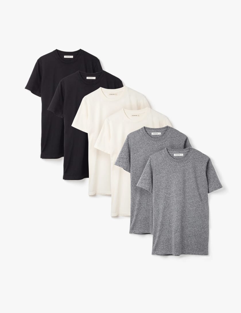


Basic Tee 6-Pack
Description
The Basic Tee 6-Pack allows you to fully express your vibrant personality with three grayscale options. Feeling adventurous? Put on a heather gray tee. Want to be a trendsetter? Try our exclusive colorway: "Black". Need to add an extra pop of color to your outfit? Our white tee has you covered.
Highlights
- Hand cut and sewn locally
- Dyed with our proprietary colors
- Pre-washed & pre-shrunk
- Ultra-soft 100% cotton
Details
The 6-Pack includes two black, two white, and two heather gray Basic Tees. Sign up for our subscription service and be the first to get new, exciting colors, like our upcoming "Charcoal Gray" limited release.
🏗️ Product with Tiered Images
Showcase product architecture or hierarchy with layered, tiered image layouts.
Usage:
{{ partial "products/with_tiered_images.html" (dict
  "heading" "Enterprise AI Architecture"
  "description" "Scalable, secure, and compliant AI infrastructure designed for enterprise deployments."
  "tiers" (slice
    (dict
      "level" "Frontend"
      "image" (dict
        "src" "https://images.unsplash.com/photo-1557804506-669a67965ba0"
        "alt" "User interface layer"
        "width" "600"
        "height" "300"
      )
      "description" "User interfaces and client applications"
    )
    (dict
      "level" "API Layer"
      "image" (dict
        "src" "https://images.unsplash.com/photo-1558494949-ef010cbdcc31"
        "alt" "API management layer"
        "width" "500"
        "height" "250"
      )
      "description" "RESTful APIs and GraphQL endpoints"
    )
    (dict
      "level" "AI Engine"
      "image" (dict
        "src" "https://images.unsplash.com/photo-1485827404703-89b55fcc595e"
        "alt" "AI processing engine"
        "width" "400"
        "height" "200"
      )
      "description" "Machine learning models and AI processing"
    )
    (dict
      "level" "Infrastructure"
      "image" (dict
        "src" "https://images.unsplash.com/photo-1558618666-fcd25c85cd64"
        "alt" "Cloud infrastructure"
        "width" "700"
        "height" "200"
      )
      "description" "Cloud infrastructure and data storage"
    )
  )
  "features" (slice
    "Auto-scaling infrastructure"
    "SOC 2 Type II compliance"
    "99.99% uptime SLA"
    "Global edge deployment"
  )
) }}
Live Example:
Basic Tee
$35
Reviews
3.9 out of 5 stars
Images


Description
The Basic tee is an honest new take on a classic. The tee uses super soft, pre-shrunk cotton for true comfort and a dependable fit. They are hand cut and sewn locally, with a special dye technique that gives each tee it's own look.
Looking to stock your closet? The Basic tee also comes in a 3-pack or 5-pack at a bundle discount.
Fabric & Care
- Only the best materials
- Ethically and locally made
- Pre-washed and pre-shrunk
- Machine wash cold with similar colors
Our Policies
- International delivery
- Get your order in 2 years
- Loyalty rewards
- Don't look at other tees
🔍 Product with Image Gallery & Expandable Details
Interactive product showcase with image gallery and expandable feature details for comprehensive product exploration.
Usage:
{{ partial "products/with_image_gallery_and_expandable_details.html" (dict
  "heading" "Advanced Analytics Suite"
  "description" "Comprehensive analytics platform with real-time insights, predictive modeling, and automated reporting."
  "gallery" (slice
    (dict
      "src" "https://images.unsplash.com/photo-1551288049-bebda4e38f71"
      "alt" "Main analytics dashboard"
      "caption" "Main Dashboard"
    )
    (dict
      "src" "https://images.unsplash.com/photo-1543286386-713bdd548da4"
      "alt" "Reports interface"
      "caption" "Custom Reports"
    )
    (dict
      "src" "https://images.unsplash.com/photo-1460925895917-afdab827c52f"
      "alt" "Data visualization"
      "caption" "Data Visualization"
    )
  )
  "features" (slice
    (dict
      "title" "Real-time Analytics"
      "description" "Get instant insights with live data streaming and real-time visualizations."
      "details" "Monitor key metrics as they happen with sub-second latency. Our real-time engine processes millions of events per second, providing instant visibility into user behavior, system performance, and business metrics."
      "icon" "chart-bar"
    )
    (dict
      "title" "Predictive Modeling"
      "description" "AI-powered forecasting and trend analysis for strategic planning."
      "details" "Leverage machine learning algorithms to predict future trends, customer behavior, and business outcomes. Our models continuously learn and adapt, improving accuracy over time."
      "icon" "sparkles"
    )
    (dict
      "title" "Automated Reporting"
      "description" "Schedule and customize reports delivered to your team automatically."
      "details" "Create custom reports with drag-and-drop ease. Schedule daily, weekly, or monthly delivery to stakeholders via email, Slack, or API integration."
      "icon" "document-chart-bar"
    )
  )
) }}
Live Example:
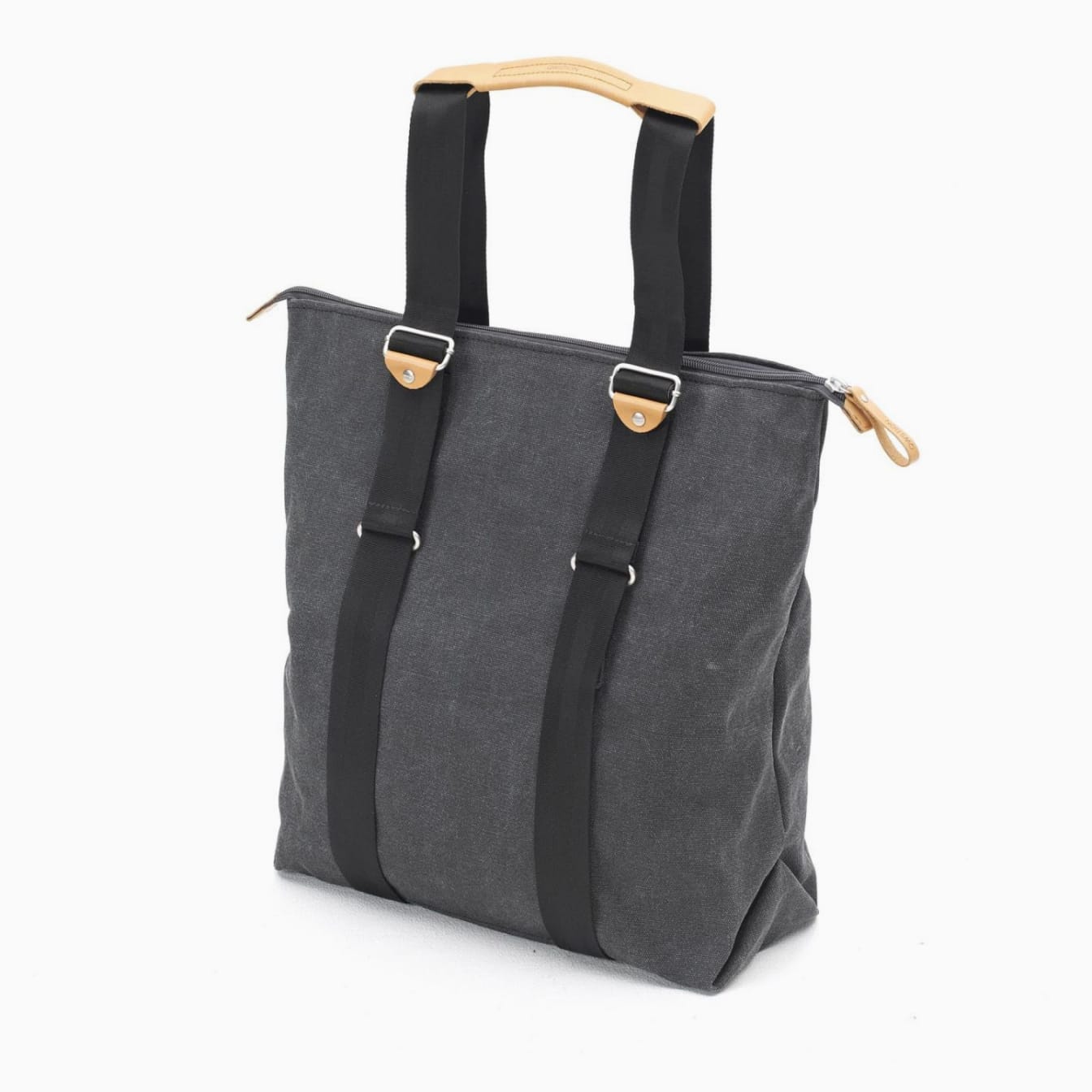
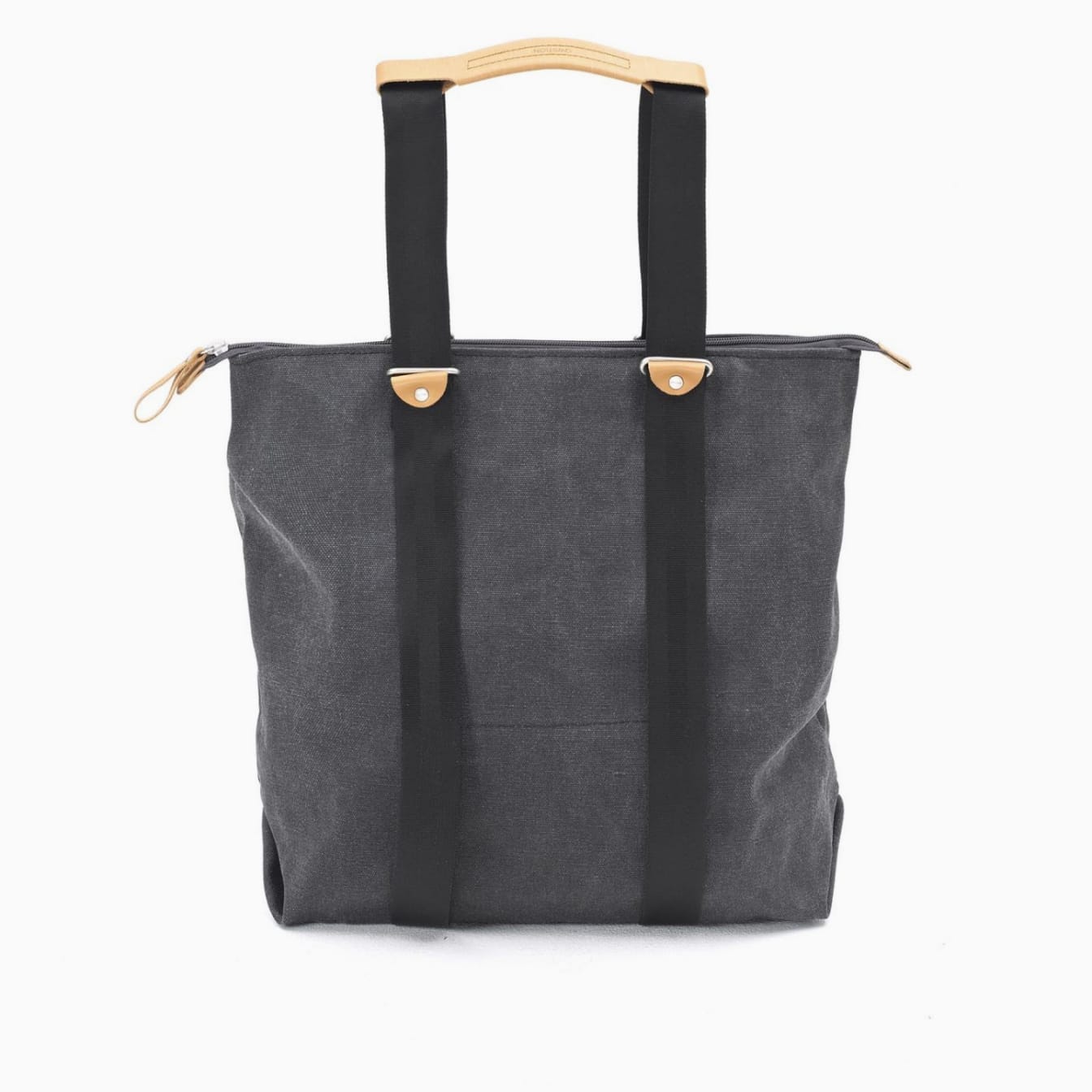
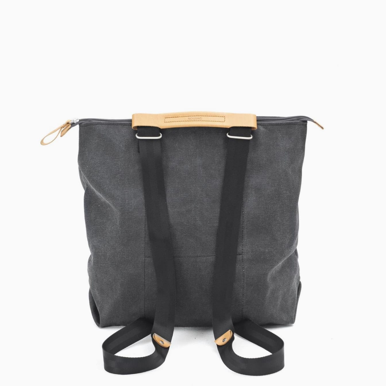
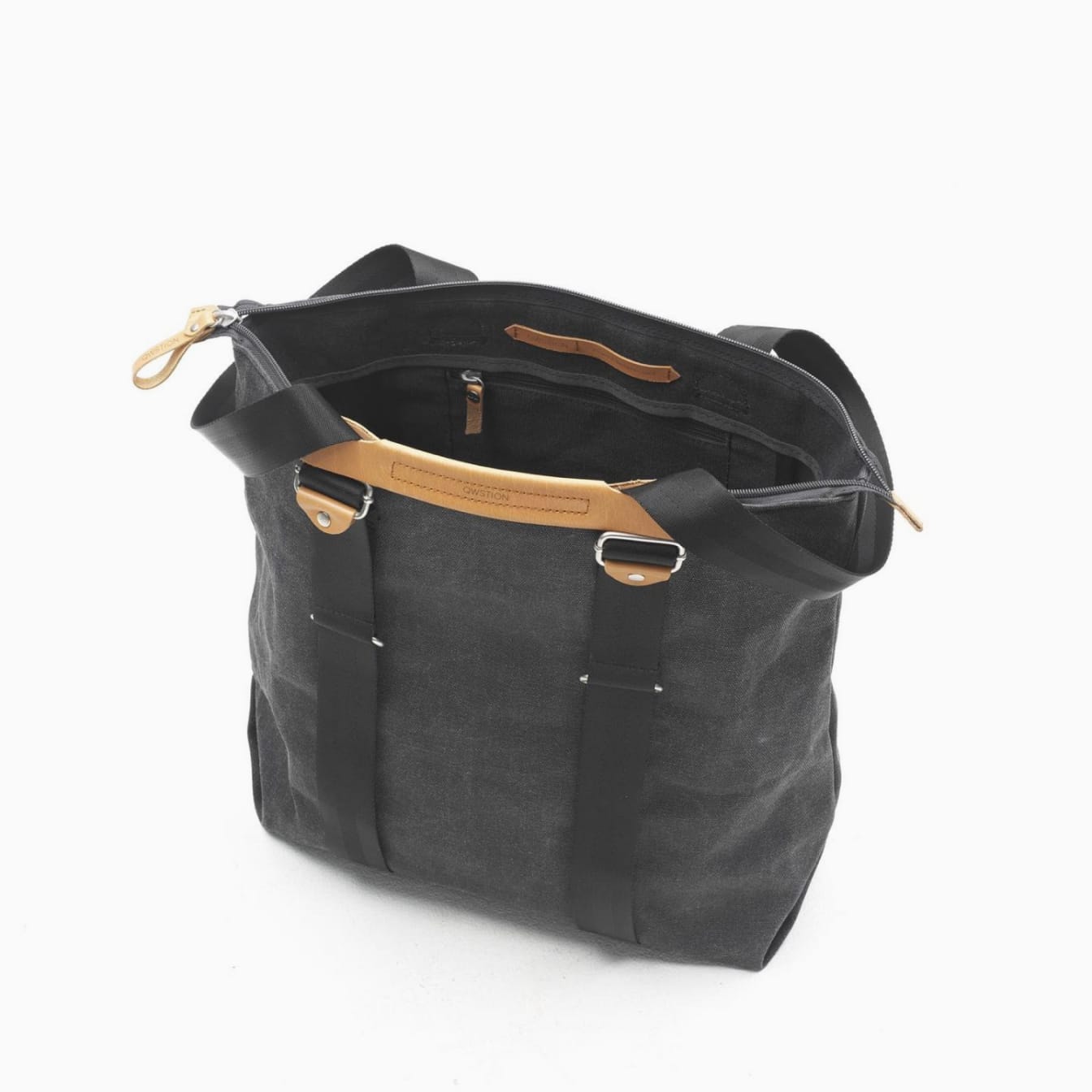
Zip Tote Basket
Product information
$140
Reviews
4 out of 5 stars
Description
The Zip Tote Basket is the perfect midpoint between shopping tote and comfy backpack. With convertible straps, you can hand carry, should sling, or backpack this convenient and spacious bag. The zip top and durable canvas construction keeps your goods protected for all-day use.
Additional details
- Multiple strap configurations
- Spacious interior with top zip
- Leather handle and tabs
- Interior dividers
- Stainless strap loops
- Double stitched construction
- Water-resistant
🎯 Product Partials Best Practices
✅ Do's
- • Use high-quality, relevant images
- • Include proper alt text for accessibility
- • Keep descriptions concise but informative
- • Use consistent image sizes within components
- • Include clear calls-to-action
- • Test on mobile devices
💡 Tips
- • Use WebP format for better performance
- • Implement lazy loading for images
- • Consider using CDN for image delivery
- • Optimize images for different screen sizes
❌ Don'ts
- • Don't use low-resolution or pixelated images
- • Don't overload with too much text
- • Don't forget responsive design
- • Don't use generic stock photos
- • Don't skip performance optimization
🔧 Customization
- • Modify CSS classes for branding
- • Adjust grid layouts as needed
- • Customize animation timing
- • Add custom JavaScript interactions
📱 Split with Image
Side-by-side product layouts with features and imagery
🖼️ Image Galleries
Interactive galleries with expandable details
⚙️ Utils Documentation
Utility functions for analytics, link building, and enhanced functionality.
View Complete Utils Guide🔧 Utils Reference
Utility partials and helper functions for common functionality like analytics, content relationships, and link building. These tools enhance your site's functionality and user experience.
💡 Tip: Utils are typically called internally by other partials or used in layouts, but understanding them helps you customize behavior and add advanced functionality.
📊 Analytics
Privacy-compliant analytics integration with consent management and tracking configuration.
Google Analytics with Consent
GDPR-compliant Google Analytics implementation with consent management and privacy controls.
Usage:
{{ partial "utils/analytics/google-analytics-consent.html" (dict
  "measurement_id" "G-XXXXXXXXXX"
  "consent_mode" true
  "anonymize_ip" true
  "cookie_domain" "auto"
  "cookie_expires" 63072000
  "debug_mode" false
) }}
Parameters:
measurement_id
Your GA4 Measurement IDconsent_mode
Enable Google Consent Mode v2anonymize_ip
Anonymize visitor IP addressescookie_domain
Cookie domain settingcookie_expires
Cookie expiration in secondsdebug_mode
Enable debug mode for testingPrivacy Note: This implementation includes consent mode for GDPR compliance. Ensure you have a proper cookie consent banner that updates the consent state.
📝 Content Utilities
Helper functions for content discovery, relationship building, and dynamic content generation.
Related Content
Automatically find and display related content based on tags, categories, or custom criteria.
Usage:
{{ partial "utils/related_content.html" (dict
  "page" .
  "limit" 3
  "match_tags" true
  "match_categories" true
  "exclude_current" true
  "sort_by" "date"
  "template" "card"
) }}
Parameters:
page
Current page context (usually .)limit
Maximum number of related itemsmatch_tags
Match by tagsmatch_categories
Match by categoriesexclude_current
Exclude current page from resultssort_by
"date", "title", "weight", or "publishdate"template
"card", "list", or "minimal"Example Output:
Building AI Workflows with FlowHunt
Learn how to create powerful automation workflows using our drag-and-drop interface...
Read more →Link Building
Intelligent link generation with proper attributes, tracking, and SEO optimization.
Usage:
{{ partial "utils/linkbuilding.html" (dict
  "url" "https://example.com"
  "text" "Learn More"
  "class" "text-blue-600 hover:text-blue-800"
  "external" true
  "nofollow" false
  "track_clicks" true
  "track_category" "outbound"
  "track_label" "footer-link"
) }}
Parameters:
url
Link destination URLtext
Link text contentclass
CSS classes to applyexternal
Add target="_blank" and security attrsnofollow
Add rel="nofollow" attributetrack_clicks
Enable click trackingtrack_category
Analytics event categorytrack_label
Analytics event labelGenerated Link Examples:
<a href="/features" class="text-blue-600">Learn More</a><a href="https://example.com" target="_blank" rel="noopener noreferrer" class="text-blue-600">Learn More</a><a href="/signup" onclick="gtag('event', 'click', {category: 'cta', label: 'header-signup'})">Sign Up</a>🔗 Integration Examples
Common ways to use utils partials in your layouts and content.
In Layout Templates
Add analytics and enhanced links to your base layouts.
<!-- In baseof.html or head.html -->
{{ if site.GoogleAnalytics }}
  {{ partial "utils/analytics/google-analytics-consent.html" (dict
    "measurement_id" site.GoogleAnalytics
    "consent_mode" true
    "anonymize_ip" true
  ) }}
{{ end }}

<!-- In footer.html -->
<footer>
  <div class="space-y-4">
    {{ range .Site.Menus.footer }}
      {{ partial "utils/linkbuilding.html" (dict
        "url" .URL
        "text" .Name
        "class" "text-gray-400 hover:text-white"
        "track_clicks" true
        "track_category" "footer"
        "track_label" .Name
      ) }}
    {{ end }}
  </div>
</footer>
In Content Templates
Enhance blog posts and pages with related content and smart links.
<!-- In single.html or blog post template -->
<article>
  {{ .Content }}

  <!-- Add related content at the end -->
  <aside class="mt-12 border-t pt-8">
    <h3 class="text-xl font-bold mb-6">Related Articles</h3>
    {{ partial "utils/related_content.html" (dict
      "page" .
      "limit" 3
      "match_tags" true
      "template" "card"
    ) }}
  </aside>
</article>

<!-- In list templates -->
{{ range .Pages }}
  <div class="border-b pb-6 mb-6">
    <h2>{{ .Title }}</h2>
    <p>{{ .Summary }}</p>
    {{ partial "utils/linkbuilding.html" (dict
      "url" .Permalink
      "text" "Read more"
      "class" "text-blue-600 font-medium"
      "track_clicks" true
      "track_category" "blog"
      "track_label" .Title
    ) }}
  </div>
{{ end }}
In Custom Shortcodes
Create reusable shortcodes that leverage utils for enhanced functionality.
<!-- Create shortcode: layouts/shortcodes/cta-button.html -->
{{ partial "utils/linkbuilding.html" (dict
  "url" (.Get "url")
  "text" (.Get "text")
  "class" (printf "inline-block px-6 py-3 bg-blue-600 text-white rounded-lg hover:bg-blue-700 %s" (.Get "class" | default ""))
  "external" (.Get "external" | default false)
  "track_clicks" true
  "track_category" "cta"
  "track_label" (.Get "text")
) }}

<!-- Usage in content -->
{{</* cta-button url="/signup" text="Start Free Trial" class="text-lg" */>}}
⚡ Performance & SEO Tips
🚀 Performance
- • Load analytics scripts asynchronously
- • Use consent mode to reduce initial load
- • Cache related content queries when possible
- • Minimize DOM queries in link building
- • Consider lazy loading for related content
📊 Analytics
- • Set up conversion goals in GA4
- • Track meaningful user interactions
- • Use consistent event naming
- • Monitor Core Web Vitals impact
🔍 SEO
- • Use descriptive link text
- • Add nofollow to affiliate/promotional links
- • Ensure internal links use relative URLs
- • Implement proper link hierarchy
- • Use related content to increase dwell time
🛡️ Privacy
- • Implement consent management
- • Anonymize IP addresses
- • Provide opt-out mechanisms
- • Document data collection practices
📊 Analytics
GDPR-compliant Google Analytics with consent management
🔗 Link Building
Smart link generation with tracking and SEO optimization
📝 Related Content
Automatic content discovery and relationship building
📋 General Usage Guidelines
✅ Best Practices
- • All partials support responsive design out of the box
- • Use proper dict structures for complex parameters
- • Include alt text for all images for accessibility
- • Test partials on different screen sizes
- • Use semantic HTML for better SEO
- • Follow consistent naming conventions
💡 Performance Tips
- • Optimize images before uploading to static folder
- • Use appropriate image dimensions
- • Consider lazy loading for below-the-fold content
- • Minimize CSS and JS when possible
- • Use CDN for external resources
🎨 Customization
- • Color parameters accept Tailwind CSS classes
- • Modify CSS classes for custom branding
- • Override partials by creating versions in your theme
- • Use Hugo's partial context for data passing
- • Extend functionality with custom JavaScript
⚠️ Important Notes
- • Image paths should be relative to the static directory
- • Always validate HTML output for accessibility
- • Test with realistic content lengths
- • Consider loading performance on mobile devices
- • Ensure GDPR compliance for analytics